CSS: Cascading Style Sheets
CSS Review Study Guide
Click here
CSS Overview
- Folder System
- What is CSS?
- Selectors
- Properties and Values
- Location
- Layout
- Responsive Design
- CSS Frameworks
- Flexbox
But first! Directory Structure
Page 81-82 in Textbook
Get Started: Folder Structure
All files for a site are stored within the main project folder, a "root" folder.
This includes:
- HTML Files
- CSS Files
- Images
- Script files
- Anything else that will appear on your site
Note: File names should not include spaces or special characters. File names ARE case-sensitive.
Get Started: Folder Structure
In your Dev folder, you will have folders for each project. This Dev folder will therefore have multiple root folders.
All assets for each project will be in the main folder,
their respective root folder.
CSS Overview
- Folder System
- What is CSS?
- Selectors
- Properties and Values
- Location
- Layout
- Responsive Design
- CSS Frameworks
- Flexbox
CSS: What is it?
CSS = Cascading Style Sheets
CSS is a "style sheet language" that lets you style the elements on your page. It adds color, boldness, and layout to an otherwise plain and boring world of HTML.
CSS is embedded inside HTML, but it is not HTML itself.
Your CSS file is separate from your HTML file.
CSS
CSS is designed primarily to enable the *separation* of document content from document presentation
- So the code you write that defines the content on the page will be different from the code you write to define the look of that code as it is rendered in the browser.
- Having CSS written separately from the HTML can provide more flexibility and control in defining the look of content. It can also enable multiple pages or elements to share the same formatting rules.
CSS Exercise
Login to your account at Codecademy. Complete the Introduction to CSS course by the end of this unit.
CSS: What can it do?
text
color
size
position
Anatomy of CSS
CSS consists of "style rules". Each style rule consists of a "selector" and "declarations" of property-value pairs:
selector {
 property: value;
 property: value;
}
body {
  color: yellow;
  background-color: black;
}
Anatomy of CSS
- We will use 'selectors' to tell the program what we want to style.
- Once you have the proper selector, you can write all of the style rules you want, using 'property-value' pairs.
Anatomy of CSS: Properties
background-colorwidthorheightfont-familyorfont-sizeborder- And many, many more!
Anatomy of CSS: Values
- background-color:
blue; - width or height:
200px; - font-family:
"Helvetica";or font-size:16px; - border:
2px,solid,black; - And many, many more!
What does 'Cascading' mean?
Parent-child relationship in CSS
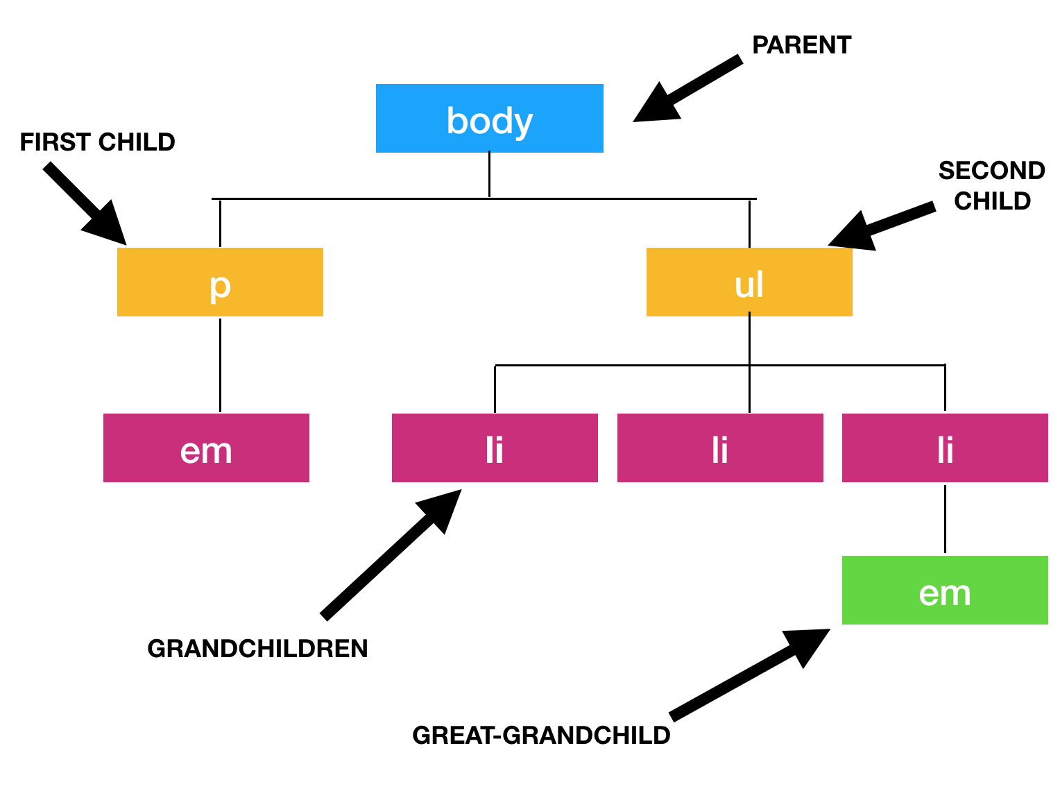
How does 'Cascading' work?
body {
  color: yellow;
  background-color: green;
}

h1 {
  color: blue;
  background-color: black;
}

p {
  color: red;
  background-color: orange;
}

p.class {
  color: turquoise;
  background-color: beige;
}
CSS Introduction
Chapter 10 in the Textbook
CSS Overview
- Folder System
- What is CSS?
- Selectors
- Properties and Values
- Location
- Layout
- Responsive Design
- CSS Frameworks
- Flexbox
The Selector
selector {
  property: value;
}
The selector is used to select which elements in the HTML page will be given the styles inside the curly braces { }.
Types of Selectors
- element
idclass- position in document
Types of Selectors: element
p {
  color: blue;
}
Selects all p elements in the entire document.
Types of Selectors: id
/* CSS FILE */
#header {
  color: blue;
}
Selects any element with the id of “header", e.g.
<p id="header"></p>
An element's id is unique and can only be used once in your HTML.
Use "#" in CSS to select the HTML element by its "id" attribute value.
Types of Selectors: class
/* CSS FILE */
.warning {
  color: red;
}
Selects any element with the class name “warning”, e.g.
<p class="warning"></p>
Multiple elements can have the same class name.
Use "." in CSS to select the HTML element by its "class" attribute value.
Types of Selectors: class
An element can have only 1 id but multiple class values, so you can take advantage of that for greater flexibility.
/* CSS FILE */
.intro {
  background-color: blue;
}
.description {
  color: red;
}
<p class="description intro">Hi. This is my paragraph.</p>
<p class="description">This is my paragraph.</p>
<p class="intro">Hi</p>
Practice here!
What colors are these three lines of HTML going to be?
Types of Selectors: class
Style rules for elements of the same class apply to the elements no matter where they are on your site (e.g., buttons, branded link colors, list item bullets).
Types of selectors: position in document
<body>
  <ul>
    <li><em>Hi</em></li>
  </ul>
  <p><em>Bye</em></p>
</body>
	/* CSS FILE */
ul em {
  color: yellow;
}
Selects any em element that's a descendant of a ul element.
The " " (space) is how you say "find a descendant."
Practice here!
Types of selectors: id + position
/* CSS FILE */
#related-brands li {
  color: gray;
}
Selects any li element that is a descendant of any element with an id that equals "related-brands."
<ul id="related-brands">
 <li>Rice Krispies</li>
 <li>NutriGrain<li>
</ul>
Types of selectors: element + class
/* CSS FILE */
li.special {
  color: yellow;
}
Selects any li element with a class that equals "special".
<ul>
  <li>Rice Krispies</li>
  <li class="special">NutriGrain</li>
</ul>
Warning: If you place a space before the ".", it'll look for descendants of li with class of "special."
Types of selectors: ALL of the above!
#header div.content form p em.required {
  color: white;
}
Let's take a few moments to explore this selector!
Selects any em element with a class attribute value of "required", that is a descendant of a p element, that is a descendant of a form element, that is a descendant of a div element with a class attribute value of "content", that is a descendant of an element with an id attribute value of "header".
Types of selectors: pseudo-classes
A set of "pseudo-classes" can style anchor elements depending on their state.
a:link { /* unvisited link */
  color: red;
}
a:visited { /* visited link */
  color: blue;
}
a:hover { /* moused over link */
  color: green;
}
a:active { /* current link */
  color: purple;
}
a:focus {  /* focused link */
  color: purple;
}
Practice here!
Types of selectors: pseudo-classes
A set of "pseudo-classes" can style anchor elements depending on their state.
a:hover a:hoverPseudo-class selectors can also apply to other html elements.
I'm a paragraph tag. Hover over me.
Grouping selectors
You can group selectors to apply the same style to all of the selectors by separating them with commas:
a:hover, a:active, a:focus {
  background-color: yellow;
}
The selector: Cascade rules
Generally:
idis more specific thanclass.classis more specific than element.- The longer the selector, the more specific it is.
- If style rules are equally specific, the last one wins!
Example:
#a #b h1 { color: red; }
#a h1 { color: blue; }
What is the difference between these two selectors?
Selectors Cheatsheet
Here is a great article to refresh your skills.
Click here for a cheatsheet.
Check out this game to practice your skills!
Coding Conventions
It is possible to write CSS like this:
selector{property:values}selector{property:values}
But this is how we will write CSS at AnnieCannons:
selector {
  property: values;
}

selector {
  property: values;
}
Notice: space between "selector" and "{", 2 spaces before property-value pair, space after "property:", semi-colon (;) after "values", followed by "}", line between rules.
Naming Conventions
Some rules to follow when making id and class names:
- Describe the content, not the presentation ("warning", not "redbox").
- Use all lowercase, and hyphens when needed for readability ("header-info", not "headerInfo").
- Use hyphens to show that a
classoridis part of something else. (e.g. "footer", "footer-copyright", and "footer-logo").
Comments
Comments are ignored by the browser and are useful for documenting styles for readability or commenting out rules.
/* Comment here */
p {
  margin: 1em; /* Comment here */
  padding: 2em;
  /* color: white; */
  background-color: blue;
}

/*
  multi-line
  comment here
*/
Test your selector skills
Click here
Advanced Selectors
Click here
CSS Overview
- Folder System
- What is CSS?
- Selectors
- Properties and Values
- Location
- Layout
- Responsive Design
- CSS Frameworks
- Flexbox
Properties
Property Value Pairs
Each property can have one or more values.
color: #333;
background-color: red;
font-family: 'Arial', sans-serif;
Note: sans-serif is a category,
while 'Arial' is the name of the font
Properties: color
The color property changes text color:
- by name, for the most common colors (e.g.,
blue) - by hexadecimal value (e.g.,
#ff0000) - by RGB value (e.g.,
rgb(255, 0, 0)) - by RGBA value (e.g.,
rgba(255, 0, 0, 0.5))
color: red; /* by name */
color: #ff0000; /* by hexadecimal color code value */
color: rgb(255, 0, 0); /* by rgb color code value */
color: rgba(255, 0, 0, 0.5); /* by rgb color code value with alpha channel */
The color property is inherited, which means it will be applied to all descendant elements but can be overridden.
Practice here!
Properties: background-color
The "background-color" property changes the background color. Besides the body element, all elements default to a transparent background.
background-color: black;
background-color: #000000;
background-color: rgb(0,0,0);
body {
 background-color: yellow;
}

table {
 background-color: #FFCC00;
}
Finding colors
To find colors or color schemes for your webpage, you can use:
- Desktop graphics programs: Adobe Photoshop
- Online tools: Coolors, Color Scheme Designer
- Browser extensions: ColorZilla for Chrome or FireFox
CSS Color
Chapter 11 in the Textbook
Property: font-family
The "font-family" property specifies the font family (or "font face") of the text. You can specify either a specific font name or a generic family name (serif, sans-serif, monospace, cursive).
font-family: "Times New Roman";
font-family: sans-serif;
A comma-separated list of font family values can be specified if you want the browser to prefer one but use the others as backup options.
font-family: "Times New Roman", serif;
font-family: "Arial", sans-serif;
font-family: Courier, monospace;
Finding Fonts
In addition to Google Fonts, you can browse for custom fonts for your webpages:
caniuse.com is a website where you can see which css properties your browser supports.
Property: font-size
The "font-size" property specifies the size of a font. It can be specified as a fixed size in various units, a percentage, or as a predefined keyword.
font-size: 1.5em;
font-size: 12px;
font-size: 100%;
font-size: larger;
font-size: 100vw;
Property: font-size (em)
The "em" unit lets you set the size of the text relative to the text around it. This makes the page resize nicely in proportion if the user changes their default font-size. The default size is "1em".
p {
  font-size: 0.9em;
}

strong {
  font-size: 1.5em;
}
Hello there!
Watch this!
Property: font-size (px)
The "px" stands for pixels, which is also often used to size images and other elements.
Because pixels are finite or fixed, this unit of measurement does not work as well when printing or resizing.
h2 {
  font-size: 17px;
}
Normal Headline
Resized Headline
Property: font-size (keywords)
These keywords can be used for imprecise sizing:xx-small, x-small, small, medium, large, x-large, xx-large.
p.footnote {
  font-size: small;
}
Two other keywords act similar to em's in setting relative size: smaller, larger.
p.intro {
  font-size: larger;
}
Property: font-size (%)
Percentage size, similar to em, is relative. While em is relative to a font's default size, % is relative to the font size of its direct parent and can be used in conjunction with other units.
body {
  font-size: 12px;
}

h1 {
  font-size: 400%;
}

h1 a {
  font-size: 50%;
}
Header Link
Property: font-size (vw)
vw stands for viewport width. vh stands for viewport height.
vw and vh allow you to dynamically set font size depending on screen size, the viewport.
Dynamic font sizing is especially helpful in responsive design.
h1 {
  font-size: 3vw;
}
More on Viewport
Watch here!Property: font-style
The "font-style" property specifies the font style of the text, either "normal" by default or "italic".
font-style: italic;
Italicized text.
Property: font-weight
The "font-weight" property specifies font thickness.
- The default is: "normal"
- Typical override is: "bold"
- You can also specify:
- "bolder"
- "lighter"
- number from 100 to 900
font-weight: bold;
font-weight: lighter;
font-weight: 800;
Bold text! Lighter text! Numbered font-weighted text!
"Shorthand" properties
A "shorthand" property in CSS lets you specify
multiple properties in one property, for conciseness.
Instead of specifying each "font-" property separately,
you can bundle them up in one "font" property.
table.geeky {
  font-weight: bold;
  font-style: italic;
  font-size: 10px;
  font-family: sans-serif;
}
Those four rules can be written as:
table.geeky {
  font: italic bold 10px sans-serif;
}
Other text properties
line-height: 10px;
Lorem ipsum dolor sit amet, consectetur adipiscing elit. Duis aliquam convallis
Click here for an example
text-align: center;
Centered text.
text-decoration: underline;
Underlined text
CSS Fonts
Chapter 12 in the Textbook
CSS Overview
- Folder System
- What is CSS?
- Selectors
- Properties and Values
- Location
- Layout
- Responsive Design
- CSS Frameworks
- Flexbox
CSS Location
Where do I write and store my CSS?
How will my CSS connect to my HTML?
CSS files
External CSS
External CSS is when our CSS is defined in a separate file, and imported using the link element. This is a best practice!
Linked stylesheet example:
<head>
  <link rel="stylesheet" type="text/css" href="main.css">
</head>
Use Case: External CSS is a best practice when you can build a project from the ground up and structure its directory.
Other ways to write CSS...
Internal CSS
Internal CSS is CSS that is in the head of the HTML file. We would put the CSS in a style tag inside the head tag:
<html>
 <head>
  <style>
   body {
    color: yellow;
    background-color: black;
   }
  </style>
 </head>
</html>
Use Case: Internal CSS is an alternative when working with platforms that have no access to an external CSS file and do allow access to the HTML head.
Inline CSS
Inline CSS is when CSS styles are assigned to individual HTML elements via the style attribute:
<tag style="property1: value; property2: value;"> </tag>
<h1 style="color:red; text-decoration: underline;">Hello</h1>
Inline styles will override internal and external CSS.
Inline CSS, therefore, should be avoided as it increases maintenance costs and blurs the line between presentation and content.
Use Case: Platforms that have no access to external CSS or the HTML head for internal CSS will permit inline CSS only.
Tools
Exercise Time!
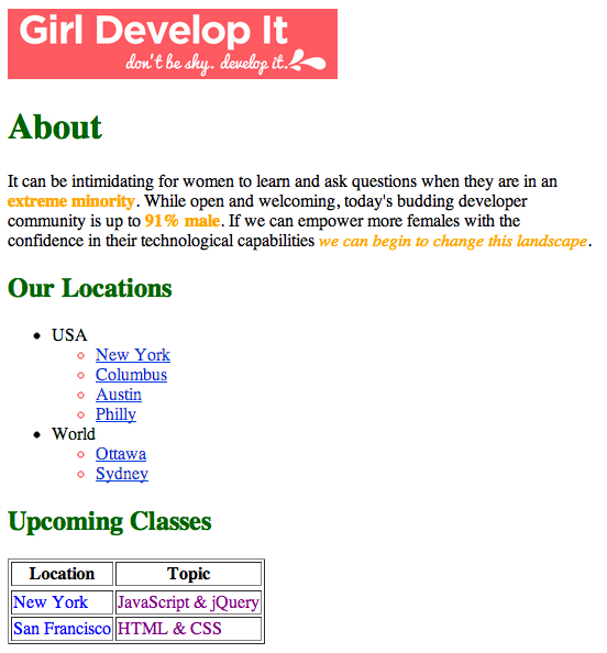
- Add the CSS to make your GDI site look like the following image: Link here.
CSS Overview
- Folder System
- What is CSS?
- Selectors
- Properties and Values
- Location
- Layout
- Responsive Design
- CSS Frameworks
- Flexbox
CSS: Layout
Overview: CSS Layout
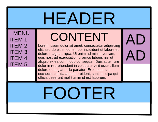
All web layouts are accomplished with block elements. Designers use blocks, most often div elements, to create rectangular areas into which all content fits.
More on the div
Watch here.
Examples here.
Overview: CSS Layout
displayproperty- Total area: The space an element occupies and affects
- Positioning
Display: Block & Inline Elements
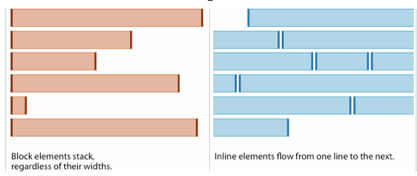
There are two main types of elements in the CSS world: "inline" and "block".
A browser generally renders a separate line for each "block" element in HTML.
On the contrary, "inline" elements go from left to right on the same line.
See next slide for a visual.
Block & Inline Elements
Grouping Elements
A grouping element lets you style multiple elements as a whole. Examples are span and div.
span creates an inline element.
<span> Hello <a href="world.com">World </a>! </span>div creates a block element.
<div> <p>Hello</p> <p>World</p> </div> <div> Hello <a href="world.com">World </a>! </div> Display
Examples:
- inline:
input, a, img, br,a few others... - block:
p, h1, ul, li, table,almost everything else...
Display Practice in JSBin
Read and reference page 317 in the textbook.
Then try this display practice!
Instructions:
- If an HTML element is by default
inline, change its display to "block." - If an HTML element is by default
block, change its display to "inline" or "inline-block." - In other words, change its
displayto be opposite of its default.
Practice here!
Box Model
Watch here
The Box Model
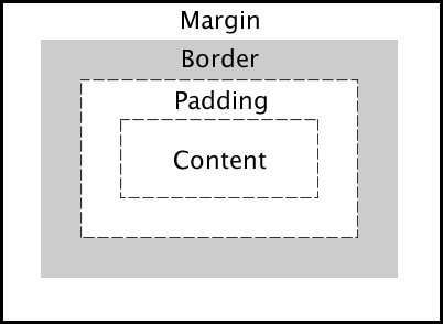
All elements are treated as boxes by the browser's rendering engine (either "inline" or "block" boxes).
A box consists of content, padding, border, and margin:
Play here!
Things to know:
In a document, each element is represented as a rectangular box.
The goal of the rendering engine for these boxes in the document is to determine its:
- size
- properties (e.g.,
color,background,border) position
Things to know:
In CSS, each rectangular box is described using the
standard box model. This model describes the amount and kind of space taken up by an HTML element.
Each box has four edges:
marginedgeborderedgepaddingedgecontentedge
CSS to define width on all browsers. See this.
body {
  box-sizing: border-box;
}
Width
Total width is how much horizontal space a block occupies. This includes the block’s content, border, and padding.
Designers have to account for width, padding and margin; using the box model makes these calculations easy.
The box model consists of these properties:
marginborderpadding
Measuring Width
You can measure width in the following ways:
- viewport width (
vw) px%
Height
Height can be set automatically given the content of the element. However, you can also select the height using:
- viewport height (
vh) px
Note: don't use %!
Margin
The margin is a transparent area around the box.
So the background of the box does not apply to this area.
The margin is a kind of "spacer" in that it separates the box from nearby elements.
15 pixels on ALL SIDES:
margin: 15px;
10px on ONE SIDE ONLY:
margin-top: 10px;
DIFFERENT MARGIN VALUES
(e.g., 10px on top, 5px right, 3px bottom, 20px left)
Note: when using this method, think of a clock;
start at the top, and go clockwise.
margin: 10px 5px 3px 20px;
More on different margin values on MDN.
Auto Margin
If the margin is set to "auto" on a box that has a set width, then the margin will take up as much space as possible on the left and right of the box.
A centered box:
<div>Hi</div>
/* CSS FILE */
div {
  margin: auto;
  width: 300px;
  border: 1px solid red;
}
Auto Margin
A flush-right box:
<div>Hi</div>
/* CSS FILE */
div {
 margin-left: auto;
 margin-right: 5px;
 width: 300px;
 border: 1px solid red;
}
Try it here!
Border
The border property styles the edge around the box and is specified as "thickness style color".
A solid red border:
border: 1px solid #ff0000;
A thick dotted black top border:
border-top: 4px dotted #000000;
2 different border styles:
border-top: 4px dotted #000000;
border-bottom: 1px solid #ff0000;
Border Thickness
Border thickness can also be specified with border-width property and can be different on each side (like margin).
10px on all sides:
border-width: 10px;
10px on top, 5px right, 3px bottom, 20px left:
border-width: 10px 5px 3px 20px;
Border Style
Border style can also be specified using the border-style property.
border-style: dashed;
border-style: double;
border-style: groove;
border-style: outset;
border-style: inset;
border-style: ridge;
Border Color
Border color can also be specified with border-color property.
Green on all sides:
border-color: rgb(0, 240, 0);
White on top, black right, red bottom, green left:
border-color: #fff black #ff0000 #00ff00;
Try it here!
Padding
The padding property specifies whitespace between the border and the content.
15px on all sides:
padding: 15px;
10px on top, 5px right, 3px bottom, 20px left:
padding: 10px 5px 3px 20px;
10px on top:
padding-top: 10px;
CSS Boxes
Chapter 13 in the Textbook
Practice
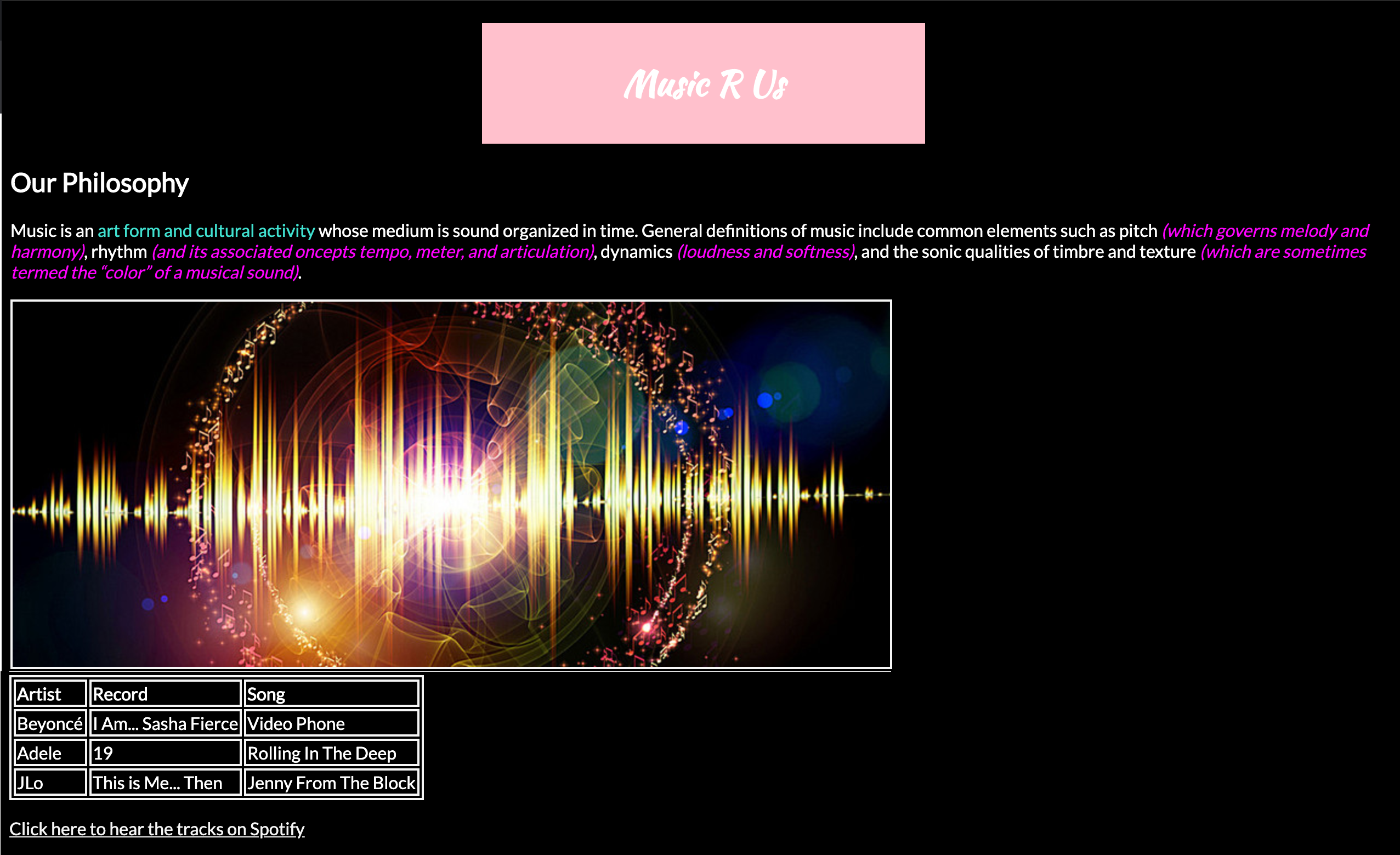
Music R Us Exercise
Get the asset here and build your site with a Kaushan Script title and Lato body text. Remember to set default font type if neither script can be displayed.
Position
Position: Static
The position property is used to specify a positioning scheme for an element. The default is "static" which puts the element in the "normal" flow.
Position: Static
In normal flow, inline boxes flow from left to right, wrapping to next line when needed.
<img src="panda.png">
<img src="panda.png">
<img src="panda.png">

Position: Static
In normal flow, block boxes flow from top to bottom, making a new line after every box.
<h1>Greetings</h1>
<p>Hola, novato</p>
<div>Hey, dude>!</div>
Greetings
Hola, novato
Position: Relative
The "relative" value will still put the element in the normal flow, but then offset it according to top/left/right/bottom properties.
<div>
  <p>Hello, hi!</p>
</div>
div {
  position: relative;
  left: 80px;
  top: 20px;
  height: 100px;
  background-color: blue;
}
Position: Relative
Note: keep an eye on the blue box.
/*CSS FILE*/
div {
  width: 100px;
  height: 100px;
  margin-bottom: 5px;
}
.box1 {
  background-color: green;
}
.box2 {
  background-color: red;
}
.box3 {
  background-color: blue;
}
.box4 {
  background-color: yellow;
}
Position: Relative
Note: check the blue box's CSS.
/*CSS FILE*/
div {
  width: 100px;
  height: 100px;
  margin-bottom: 5px;
}
.box1 {
  background-color: green;
}
.box2 {
  background-color: red;
}
.box3 {
  background-color: blue;
  position: relative;
  left: 30px;
}
.box4 {
  background-color: yellow;
}
Position: Relative
Practice here!
Position: Absolute
The "absolute" value will take the element
out of the normal flow
and position it in relation to the window
(or the closest non-static parent).
Position: Absolute
<div class="top-button">Up here</div>
<div class="lower-button">Down here</div>
/* CSS FILE */
.top-button {
  position: absolute;
  top: 10px;
  right: 10px;
  background-color: lightblue;
}
.lower-button {
  position: absolute;
  bottom: 5px;
  left: 60px;
  background-color: green;
}
Position: Absolute
Note: keep your eye on the blue box.
Position: Absolute
Note: check the blue box's CSS.
/*CSS FILE*/
div {
  width: 100px;
  height: 100px;
  margin-bottom: 5px;
}
.box1 {
  background-color: green;
}
.box2 {
  background-color: red;
}
.box3 {
  background-color: blue;
  position: absolute;
  right: 30px
}
.box4 {
  background-color: yellow;
}
Postion: Absolute
Practice here!
Position: Fixed
A position of fixed will make an element in the browser window stay put as the user keeps scrolling.
nav {
  position: fixed;
}
position:fixed is often used for nav bars, news videos or video ads at the bottom right corner of a window, etc.
Check out more values for position on MDN.
z-index
The z-index property specifies the stack order of positioned elements, in case they overlap. The element with highest z-index goes on top.
<div class="lower-index"> Bottom </div>
<div class="higher-index"> Top </div>
.lower-index {
  position: absolute;
  bottom: 0px;
  left: 60px;
  background-color: red
}
.higher-index {
  position: absolute;
  bottom: 10px;
  left: 60px;
  background-color: green;
  z-index: 2;
}
Z-Index
Practice here!
CSS Layout Review
Go through at your own pace
Click here for Learn LayoutExercise Time: CSS Boxes!
Click here for a Google Doc
CSS Position and Layout
Chapter 15 in the Textbook
Review: Directory Structure
- When you first open your IDE, what is the first file to create in your project folder?
- How do you add styles to this project folder?
- How do you add CSS to your HTML file?
Review: What is CSS?
- What does CSS stand for?
- Please explain the "C" in CSS.
- What are the three ways we can add CSS to a project?
Review: CSS That!
CSS can be applied to the following:
(please select all that apply)
Review: CSS Anatomy
Please list in the correct order:
- ;
- value
- {
- selector
- }
- property
- :
/* Please list the order here */
Review: CSS Selectors
Please give an example of:
- an element selector
- an
idselector - a
classselector - a position in document selector
- an
idand position selector - an element with
classselector
Review: True or False
- Pseudo-classes are especially NOT useful for styling links.
- Property-value pairs make up declarations.
border-coloris an example of a "shorthand" property.
Review: Eliminate This!
All of the following things are needed to add a Google font to a project EXCEPT:
- a font-family property-value pair
- a script to display the font
- a link to embed the font
- a link to external CSS
Review: 3 Ways to CSS That!
Mix and Match the following:
- internal CSS is to
- external CSS is to
- inline CSS is to
- the link tag in the head tag in an HTML file
- the style tag in the head tag in an HTML file
- the style attribute in an HTML element
Review: Display
Complete the following statement:
Every HTML element has a default display of
________ or ________.
Review: Find the Imposter!
What does NOT belong in the box model?
- margin
- white space
- content
- padding
- border
Review: Position
Unscramble this:
The default position of an HTML element is cttias.
True/False:
Otherwise, position can be fixed, sticky, relative or absolute.
Check it out in action here
Practice: MySpace for Coach
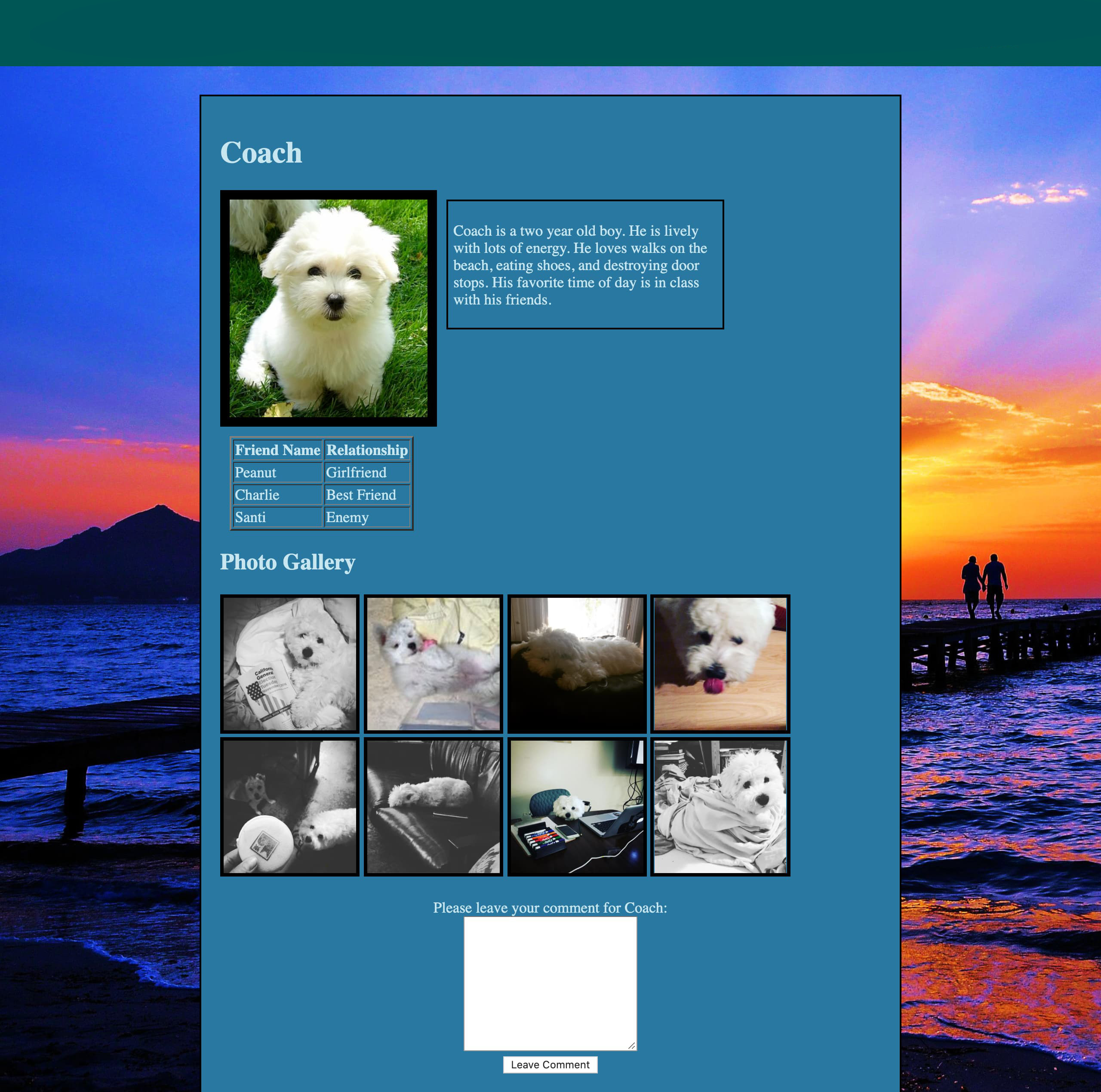
Click here for image and design assets
Cross-browser Compliance
Internet browsers have their own default styles. So, even if you did not write any CSS, the default style of the browser will apply when the content is displayed on the page.
Times New Roman font family | 16px font size | color palette
Different browsers may apply a small subset of these rules differently. So front-end developers need to be aware of 'cross-browser compliance' issues, which we may explore more fully in future lessons.
CSS Review Questions
- What is the difference between HTML and CSS?
- What are the different ways you can add CSS to your webpage?
- What is the difference between a selector, property, and value in CSS?
- What are the different types of selectors?
- How do you write an id in your HTML for a
pelement? How do you select it in CSS?
CSS Overview
- Folder System
- What is CSS?
- Selectors
- Properties and Values
- Location
- Layout
- Responsive Design
- CSS Frameworks
- Flexbox
Responsive Design
Responsive Design
What is responsive design?
- Responsive web design is a collection of techniques for building websites that work at multiple screen sizes (e.g., desktop, laptop, tablet, mobile).
- Previously, most web professionals often created a mobile version of their site and a desktop version.
- They end up with two separate websites.
- Thus, website maintenance issues double.
- Worse, the site would not work on mobile at all.
Responsive Design
Prior to responsive web design, most web designers thought in terms of print design with fixed pixel-based units.
The goal was to make websites look exactly the same in every size browser, no matter how big or small the screen.
Responsive design discards these tenets about fixed-value layout. Instead, responsive design approaches layout in terms of ratios (relative size) or percentages (% size).
Think: em!
Play here!
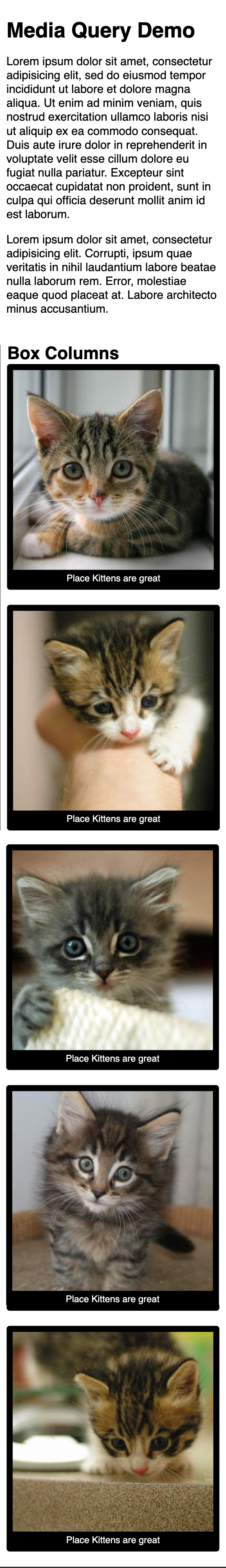
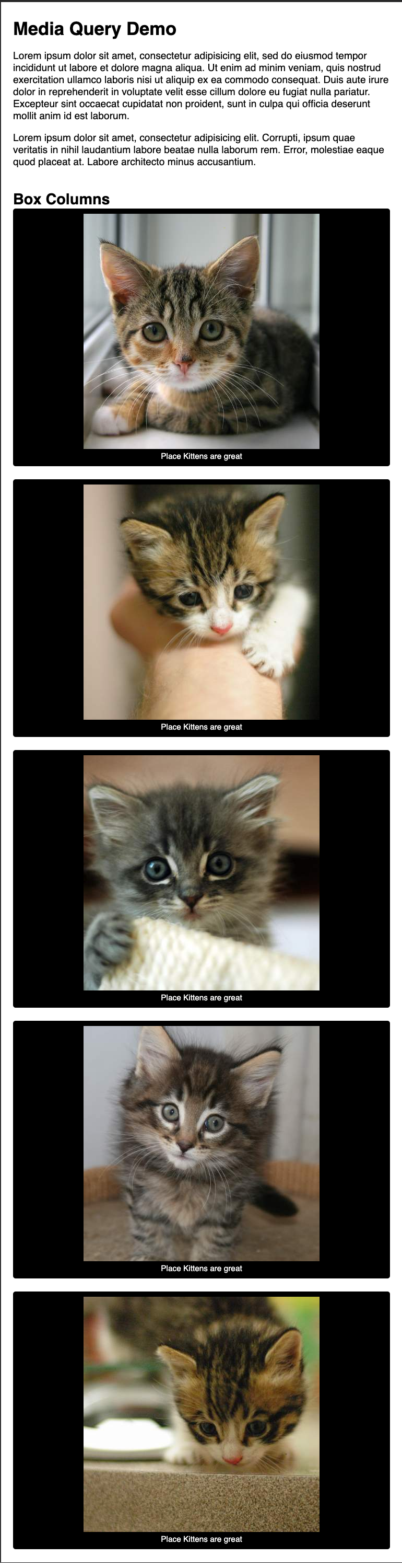
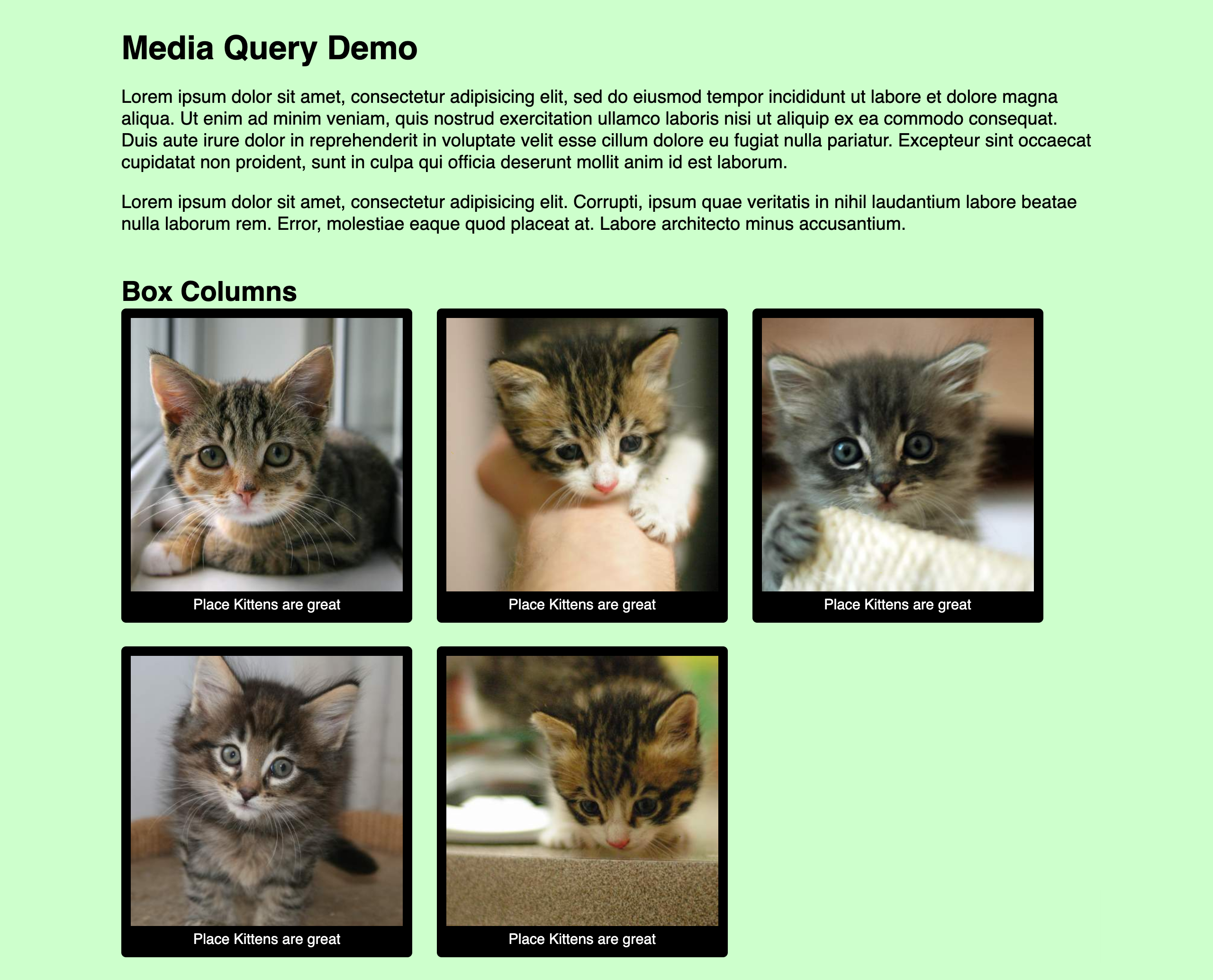
Media Queries
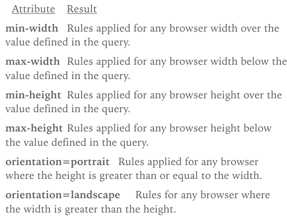
Media queries are CSS rules that apply CSS code only when certain conditions are met. These conditions are called media features.
In responsive web design, the media feature most commonly used is width (e.g., minimum width [min-width], maximum width [max-width],) of a media type (e.g., screen).
Media Queries
In responsive web design, a breakpoint is a width where the current layout no longer works and the layout breaks.
If the layout breaks, another media query must apply to adjust the layout to fit the new width.
Click here to see breakpoints in actionCSS Media Queries
A media query consists of a media type (e.g., screen) and an optional combination of media features (e.g., width).
CSS rules inside the query (within the curly braces) will be applied only if the query is true.
You can always Google 'media query syntax'
@media <media types> and <media features> {
  /* media-specific rules */
}
Resolution Queries
Modern mobile browsers support media queries which depend on the width and/or orientation:
Example: Targeting iPads using screen width
@media only screen
 and (min-width : 768px)
 and (max-width : 1024px) {
  img {
   width: 100%;
  }
}
Resolution Queries
Media queries are now usually based on min-width and max-width based on window size, not device size.
@media screen and (max-width: 640px) {
  #sidebar {
    display: none;
  }
}
@media (min-width: 768px) and (max-width: 979px) {
  #sidebar {
    width: 200px;
  }
}
Media Query Attributes
min-width is most often used when building "mobile first."
Responsive Design vs. Mobile First Design
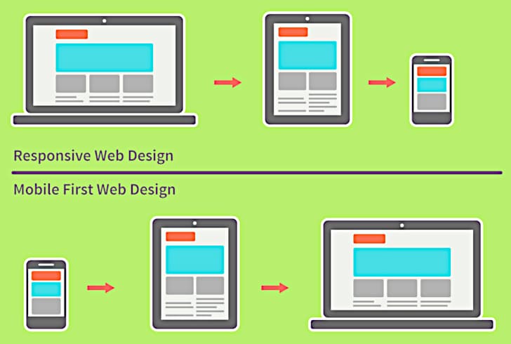
Mobile First
Mobile first prioritizes a user's mobile online experience first, before considering wider screen sizes.
A developer is building mobile first when they develop the mobile version of a site first
before adding media queries for wider screens.
Why build mobile first?
Check out these stats.
It's also easier to build from small to big (mobile first)
than big to small (desktop first).

More on Mobile First Design
Mobile First Breakpoints
Since min-width is a frequent property used in media queries when building mobile first,
all CSS styles outside of a media query will apply to what screen size? Yes! Mobile!
Therefore, we will only need media queries for the following breakpoints in screen sizes:
- Tablet
- Laptop
- Small desktop
- Large desktop
Mobile First Media Queries
| Tablet |
|
|---|---|
| Laptop |
|
| Small Desktop |
|
| Large Desktop |
|
Note: Code in such a way that no breakpoints beyond 1440px are needed.
Notes on Media Queries
- The
min-widthbreakpoints inpxfor media queries will most likely be similar to the previous slide's specifications. - Inside a media query, any CSS property can be applied to an HTML element.
- For
widthper HTML element, determine whether to use:px%(fit to parent)vwem
/* Example */
@media screen and (min-width: 1440px) {
  #sidebar {
    width: 20%;
  }
}
Mobile First Media Queries Practice
Try it in JSBin!- Instructions:
- Try commenting out different media queries.
- Use Chrome Dev Tools to view what results.
- Select an HTML element to apply CSS using media queries.
- Then use Chrome Dev Tools to view the results.
- Be prepared to discuss your observations in class.
More on Media Queries
Reference the MDN documentation
Watch the Responsive Design video review
Check the Responsive Design Checklist
Feel free to watch this Mobile First CSS video and follow/code along!
Mobile First Exercise
| Mobile | Tablet | Desktop |
|---|---|---|
 |
 |
 |
Click on this link for image and design files.
CSS Overview
- Folder System
- What is CSS?
- Selectors
- Properties and Values
- Location
- Layout
- Responsive Design
- CSS Frameworks
- Flexbox
With our intermediate coding knowledge now, it's time to have some fun with a framework!
CSS Frameworks
What is a framework?
CSS frameworks are pre-prepared software code that allows for easier, more standards-compliant web design using the CSS language.
Most languages have frameworks that make our job as a developer easier.
The style rules are already written, all you have to do is add proper classes to you HTML!
A review and intro
A lovely review thanks to GDI
Click hereCSS Frameworks
What does a CSS framework consist of?
Usually includes:
- a reset
- a grids system
- styles for typography
- styles for forms
- Note: Some include support for mobile/print.
Enter Bootstrap! Bootstrap is a commonly used CSS framework that includes a grid system and easy-to-use CSS styling techniques.
Bootstrap
Check it OUT!
Bootstrap Grid System
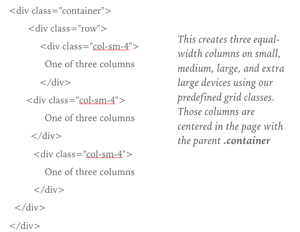
A grid system lets you layout pages according to fractions of a grid (usually 12, 16, or 24 columns).
Bootstrap includes a powerful mobile-first grid system for building layouts of all shapes and sizes. It’s based on a 12-column layout.
Watch here!Bootstrap Grid System
- There are three major components—containers, rows, and columns.
- Containers
class="container"for fixed widthclass="container-fluid"for full width, which centers your site’s contents and helps align your grid content.
- Rows are horizontal groups of columns that ensure your columns are lined up properly.
class="row" - Content should be placed within columns.
class="col"
Bootstrap Grid System
- Column classes indicate the number of columns you’d like to use out of the possible 12 per row. So if you want three equal-width columns, you’d use
class="col-sm-4"in HTML and select.col-sm-4in CSS. - Column widths are set in percentages, so they’re always fluid and sized relative to their parent element.
- Columns have horizontal padding to create the gutters between individual columns.
- There are five grid tiers, one for each responsive breakpoint: extra small (
.col-xs), small (.col-sm), medium (.col-md), large (.col-lg), and extra large (.col-xl).
Bootstrap Grid System
Bootstrap Grid System Activity
Let's build this together!
One of three columns


Second of three columns


Third of three columns
Create a Grid With Bootstrap
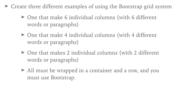
Copy the instructions here
FreeCodeCamp
Click here for exercises on Responsive Design
Another Bootstrap Challenge
CSS Overview
- Folder System
- What is CSS?
- Selectors
- Properties and Values
- Location
- Layout
- Responsive Design
- CSS Frameworks
- Flexbox
Flexbox
Flexbox
Flexbox makes aligning elements and centering them vertically and horizontally super easy!
Keeps you from feeling like this:
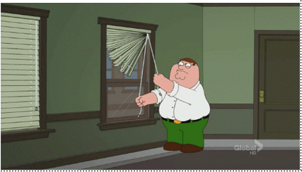
Flexbox!
Flexbox LectureFlexbox Properties
For the parent:
display: flex;- Determine if parent needs a
height flex-directionjustify-contentalign-items
Flex-direction
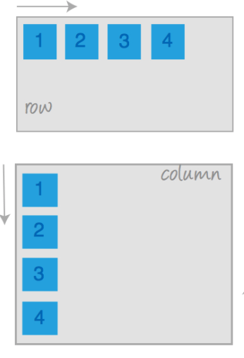
flex-directionhas a default setting of "row"flex-directionsets the main axis along which its children align; the default main axis is horizontal.- Use
flex-direction: column;on the parent to change the orientation of the children and set the main axis to be vertical.
justify-content
justify-contenthas a default setting of "flex-start"- This property changes the positioning of the children along the main axis.
- Possible values:
flex-startflex-endcenterspace-betweenspace-around
align-items
align-itemshas a default setting of "flex-start"- This property changes the position of the children along the cross axis.
- Possible values:
flex-startflex-endcenter
Flexbox Game
CSS Advanced
For so much more......Click here
CSS Overview
- Folder System
- What is CSS?
- Selectors
- Properties and Values
- Location
- Layout
- Responsive Design
- CSS Frameworks
- Flexbox
Your Yogurt Shop Assignment
Make a responsive site based on the given designs and assets.
Make sure you use Bootstrap and Flexbox!
CSS Roundup
Click here
THE END
Thank you for your attention!